Spesati
Redesigning the checkout flow for an international audience
Exploratory research | Usability testing
Project Overview
Client: Spesati is Italy’s first fully online grocery store. Initially catering solely to the Italian market, Spesati has gained a lot of momentum and there is now a demand not only from global customers, but also an influx of English-speaking tourists who travel to Sardinia, Italy for the holidays who are looking for home delivery services.
My role: UX Designer, Lead Researcher, UI support
Timeline: 7 weeks
Tools: Pen/paper, Figma, Zoom, Google Hangouts, Miro
Research methods: Benchmark usability testing, moderated remote 1:1 testing
Deliverables: HiFi prototype
The problem
Spesati’s original project requirements were to redesign the website’s signup page, which they knew was problematic due to the number of customer calls coming in that were related to the page. Spesati wanted a simple-to-use account creation page that would cater to their top 5 target groups: English speakers in Italy, France, Germany, UK, USA.
Strategy
For this project, although the client only sought to improve the signup page, I wanted to start off with a holistic approach and begin with testing a customer’s entire checkout journey, which included undergoing the signup page process. This would help us understand the context of completing the signup process and identify other gaps that the process could be related to.
In doing so, we found out fairly early on that the main issue with customer dropoff wasn’t primarily due to the confusion of the signup page (although the page did have its fair share of problems), but due to the actual checkout flow itself, of which the signup page was a part of. This left us with one major question for the client.
Do you have the resources for us to completely redesign the checkout flow so we can create the optimum experience for your customers or are we limited to only fixing the issues related to the signup page?
Fortunately, we were able to show Spesati the value of improving the entire checkout flow rather than focusing on one singular point and the budget for the scope expansion was approved.
My process:
- Discovery
- Comparative research on multilingual websites
- Designing wireframes
- Validation testing
- Applying user feedback and handoff
- Learnings
1. Discovery
For this initial round of testing we tested with 5 users that were based in North America. Although we were designing for an international audience, due to limited time and resources I made the decision to perform the initial test with users who would be easier to recruit and save our valuable international users for the second round of testing.
I recruited for users who have or would use eCommerce websites, with the majority of the users being aged 50+: Spesati’s main age group.
Key findings:
- Users found the signup/account creation page confusing due to:
- Confusing copy in the form fields - Spesati had standard copy that was geared towards an Italian audience and was thus confusing to international customers
- Misaligned expectations - users did not know why so much information was required for what should be a simple account creation page and for what purpose
- Users experienced a disjointed checkout flow compared to what they’re used to
- Users only wanted to sign up for accounts if they knew they would be returning customers and would otherwise want a guest checkout experience
- Users were not clear what mistakes they were making that was preventing them from proceeding onto the next step

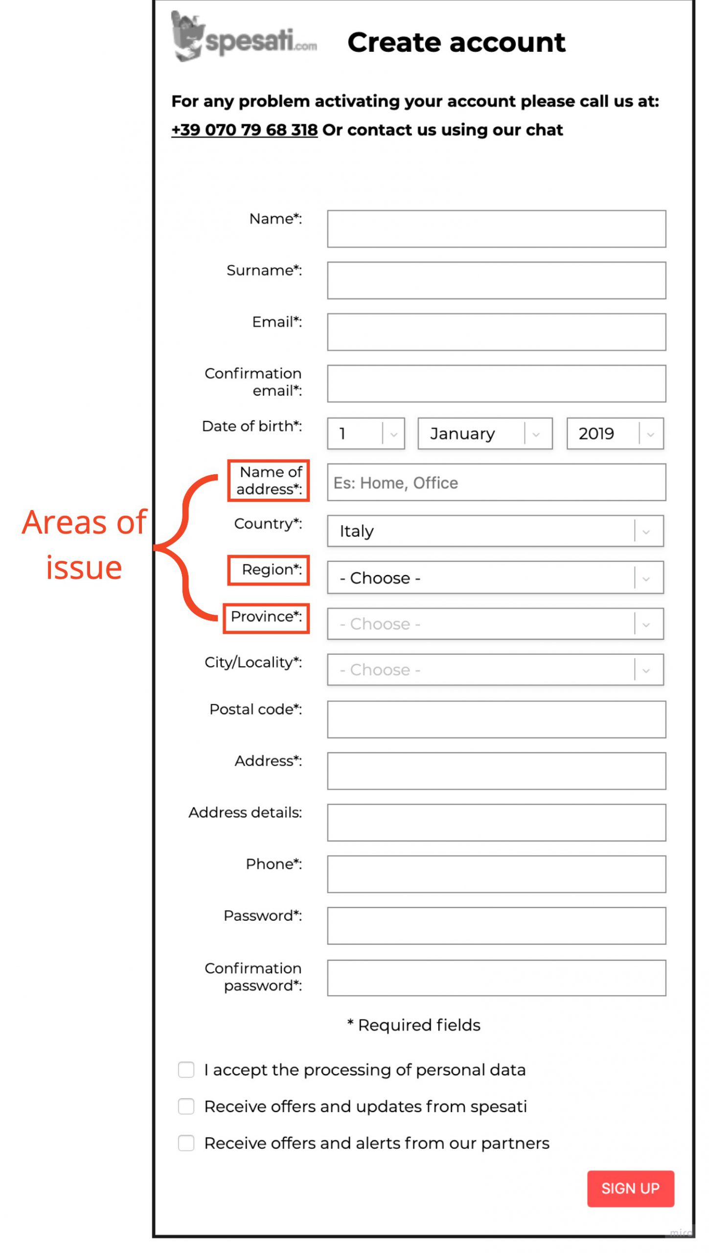
The crux of the problem: users experienced issues beyond completing the registration form. If we wanted to create the optimal and most streamlined experience for customers we would need to assess with the client if there was capacity to elaborate on the original project requirements.
2. Defining the problem statement
Now that we understood what the main issues were and had the go-ahead from the client to expand the original project scope we came up with the following problem statement:
- How might we redesign the checkout flow so that customers experience a seamless checkout flow that incorporates account registration into Spesati’s current checkout process?
3. Comparative research on multilingual websites
We researched other major eCommerce websites that had an international presence and underwent their checkout to understand best practices. Because one of the major issues we uncovered was the copy related to the address fields it was important for us to get the wording correct in a way that each of the targeted localized target groups (Italy, UK, USA, France, Germany) would understand.
4. Designing wireframes
Based on the issues our users experienced and what we learned from our comparative research analysis we decided to prioritize the following in our designs:
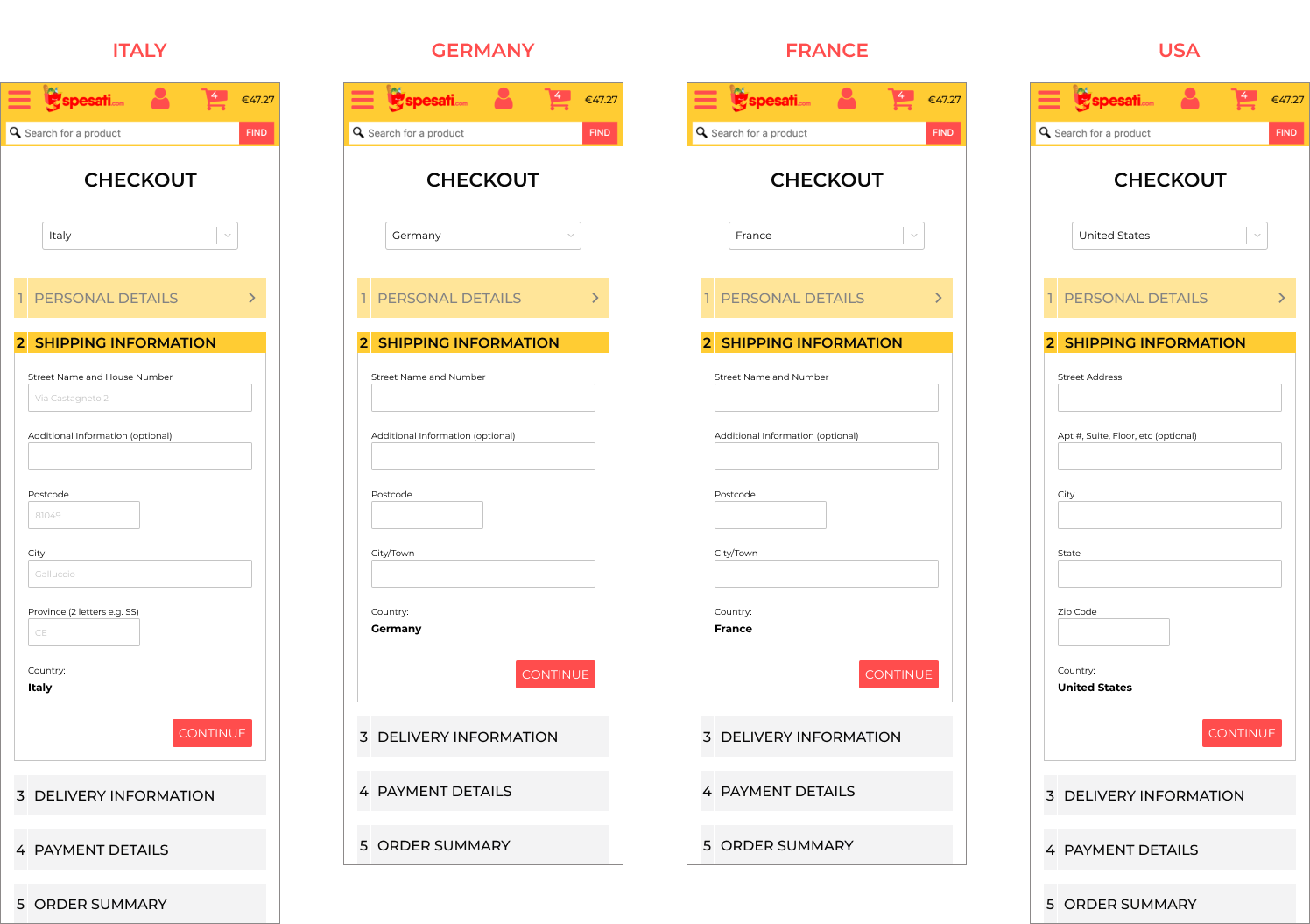
- Customize the copy of each of the geographical target groups so the shipping information is relevant to where customers are having their items shipped to
- Include progressive disclosure so users know which step they’re on and how many steps still remain
- Include inline form validation so users know if the field has been completed correctly
- Include a guest checkout for those who want to to try out the service before submitting personal information to create an account
- Remove the need to validate email address so customers can smoothly make their purchase


5. Validation testing
We performed validation testing across the following countries: UK x3 users, USA x3 users, Germany x2 users, France x2 users, Italy x2 users. It would have been ideal to have 5 users across each country but this was a limitation we worked with due to limited time and the client’s limited budget for user incentives.
Key findings:
- All form fields were well understood across all the different countries
- All users completed the checkout process without any major issues
- Users felt comfortable inputting sensitive information due to the accompanied help text and transparency of why certain information was required
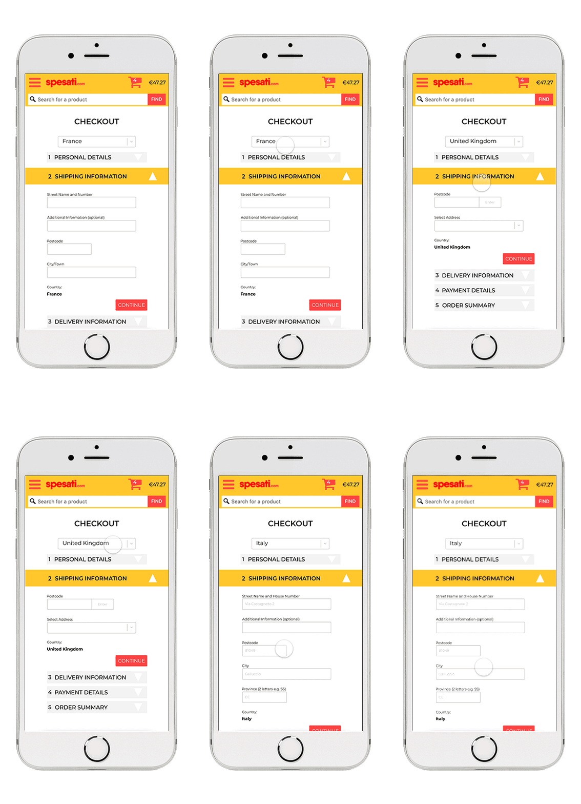
6. Final designs
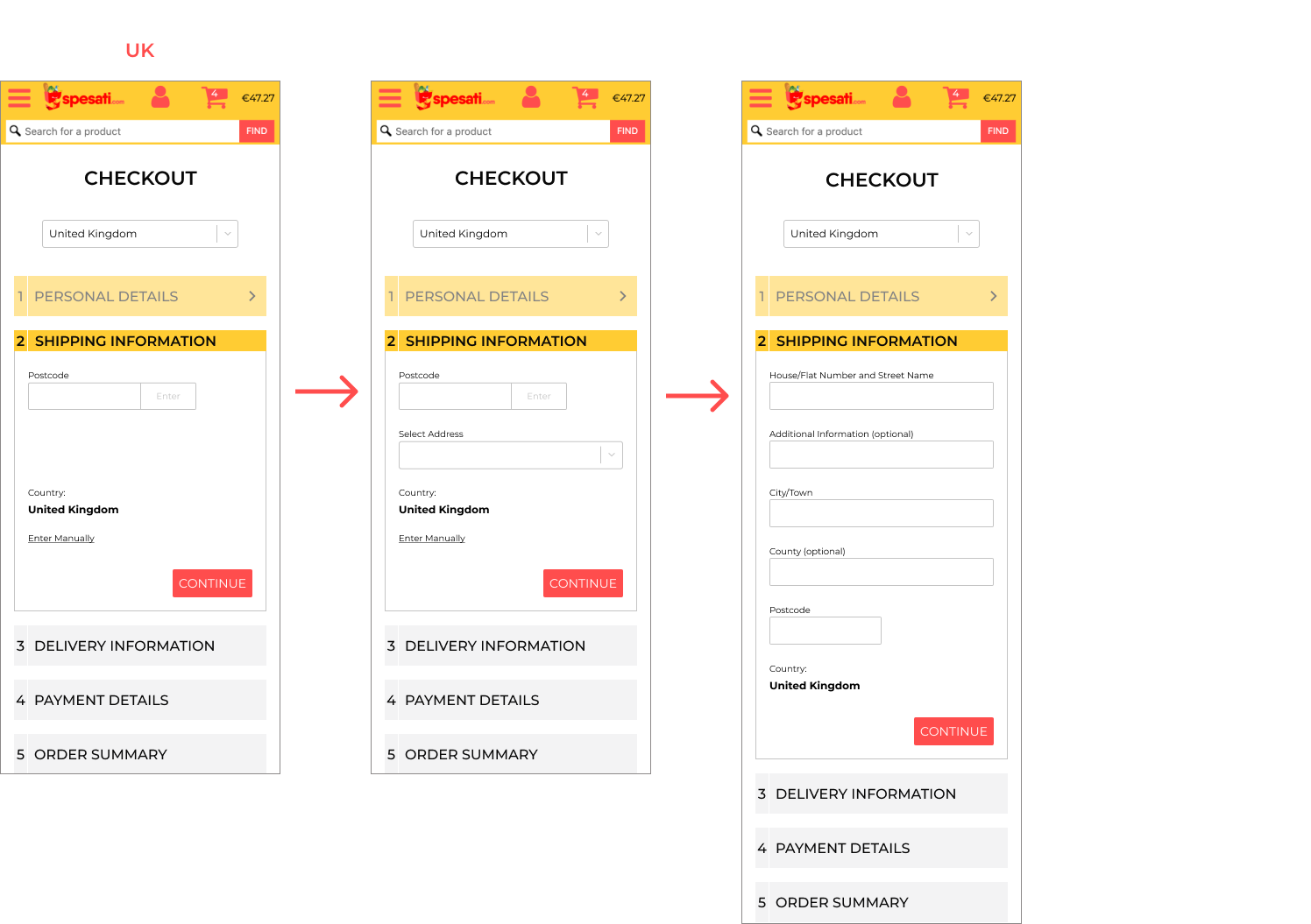
After sketching, testing and creating mutiple mid-fi iterations, we created the final designs incorporating Spesati's current brand guidelines. Below are the final screens used for the Italy checkout flow.

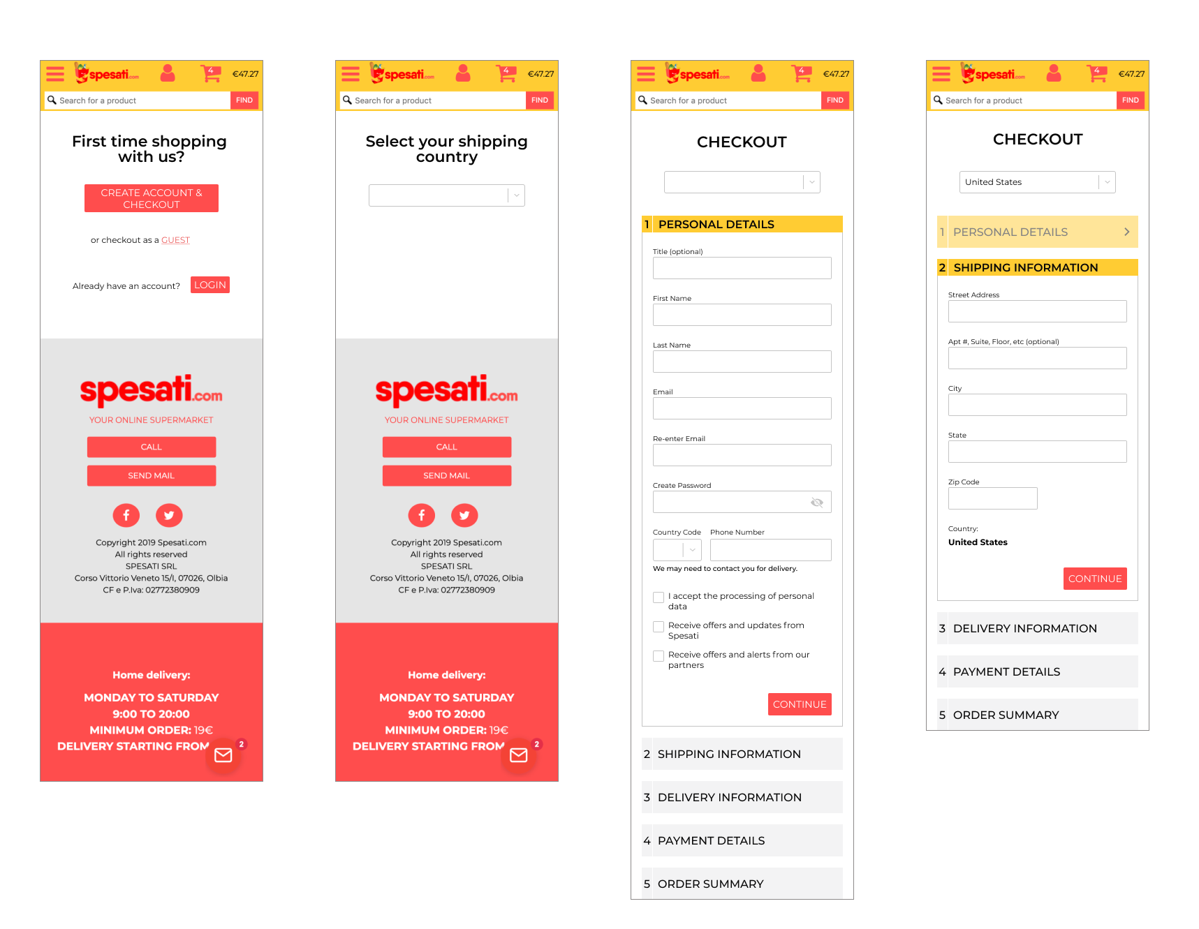
The shipping information fields dynamically changed according to the shipping country input:
7. Takeaways and working with constraints
This project was great to test how we could work with many constraints and how to prioritize user needs vs. user wants.
1. Working with a tight time frame - although the project scope grew, the delivery time remained the same. As a team, we addressed this by coming up with a project plan that left no cushion room for error or setbacks. This is not something I would generally practice but it was necessary in this case.
2. Limited budget for user incentives - with two rounds of user sessions lined up - the first for usability and the second for validation testing - I knew it would be more important to save our resources to recruit for our second round of testing. This judgement call meant we reached out to friends and family who could perform usability testing as a goodwill gesture. Another way I tackled our budget constraints was to recruit for users who could test for more than one country (eg. Originally from France, now living in USA etc). This enabled us to not only cut down on the number of user sessions, but also allowed us to stretch our incentives budget further.
View selected projects

Global energy companyA platform to update stakeholders in a crisis situation

Ada's ListImproving relationship building for female changemakers in tech

Little FeministClarifying the value proposition to increase readership
SpesatiRedesigning the checkout flow for an international audience


